

Image Description: a resplendent picnic scene featuring flowers, fruits, cakes and many bottles of a sparkling tea product called “Tea Crush”. photo shot and styled by Maya.
starting in the spring of 2017, I started working with a new sparkling tea brand called Tea Crush. this was just when the La Croix craze was really starting, and Tea Crush was entering the rapidly growing carbonated beverage space.
Tea Crush as a brand is energetic, approachable and sassy. But beyond its cute appearance it also delivers when it comes to health & wellness; each bottle has no added sugars, is relatively low-calorie and contains superfoods and herbs. the challenge was to create a look & feel that was not overly technical or serious, and one that could show that making healthier choices didn’t have to compromise with flavor or fun.
below is a selection of some of the design and photography work I produced for Tea Crush. all photography, graphics design (including the labels of the bottles) and art direction by me.


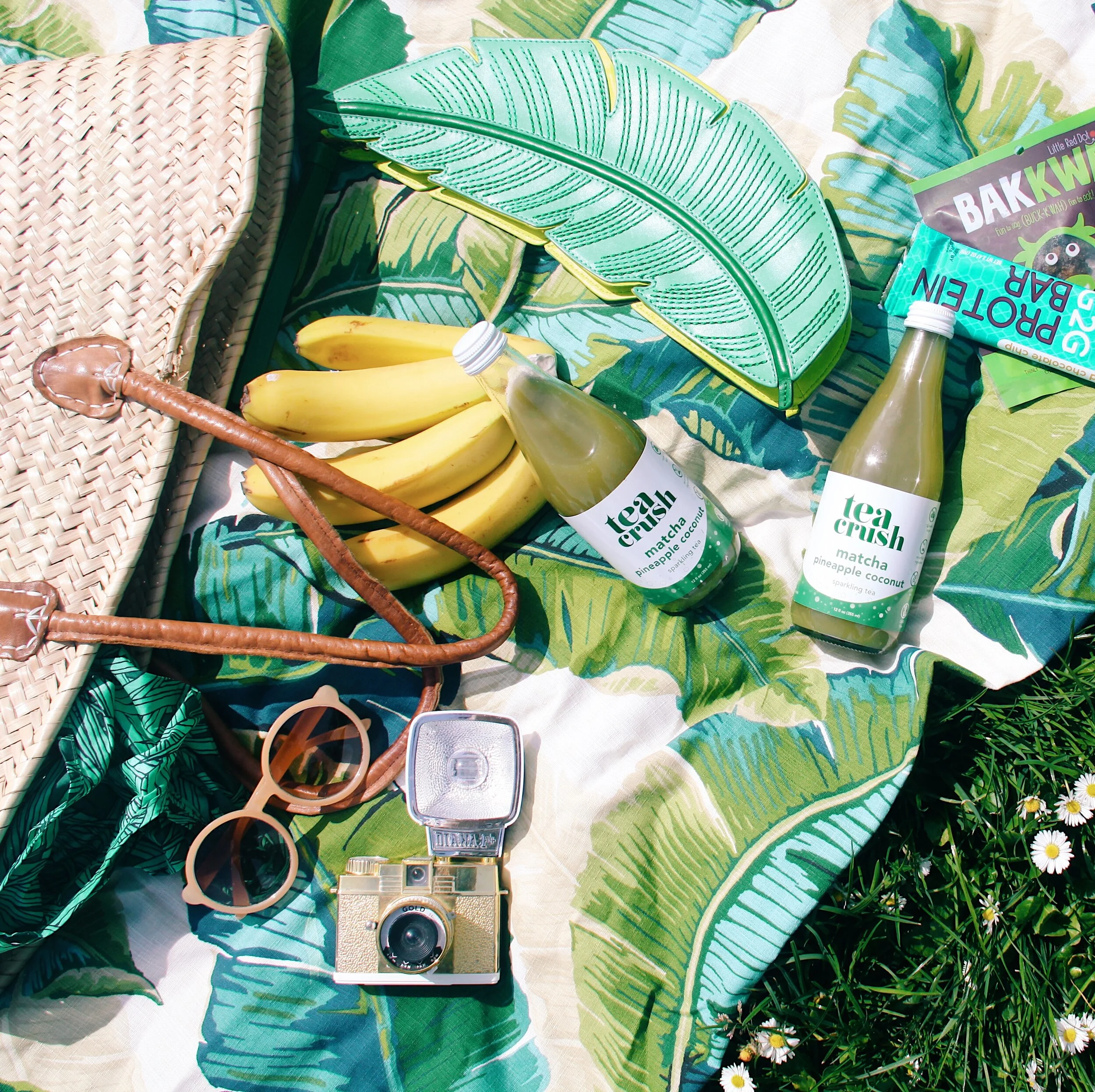
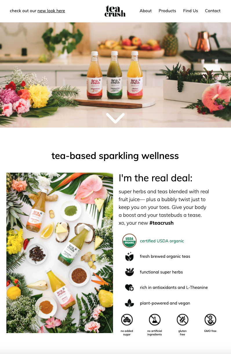
Image Description: a screenshot of Tea Crush’s home page, www.teacrush.com as of March 2020. Photography by me.
logo design process


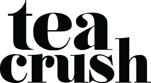
Image Description: Tea Crush’s logo. made with Nouvelle Vague font, a serif font.
the logo & fonts
the logo was made with Nouvelle Vague with some minor changes to make parts of the font bolder to increase its legibility. the lower case and rounded appearance of the font added cuteness, while the serifs gave a luxury feel that was still down to earth; it is both aspirational and approachable.
the other font used throughout the label, social media and website was Avenir Next. Avenir is an approachable, cute and modern sans-serif font.
the wave
a recurring design element that I used for the brand was a color overlay with the same wave shape. the shape was used on all versions of the label for the bottle and on select marketing flyers. the wave shape conveys a sense of refreshment, playfulness and delight.

designing the label
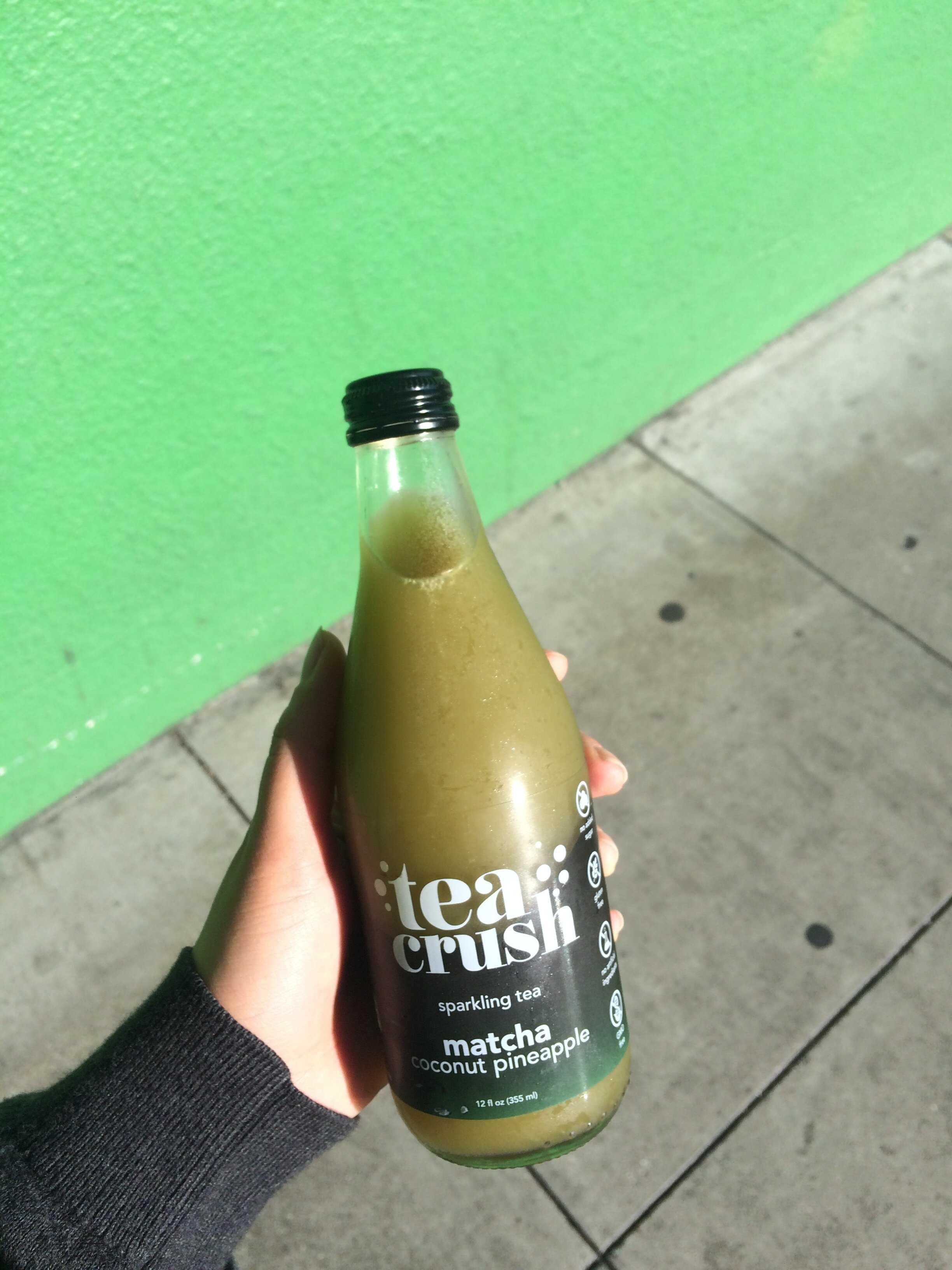
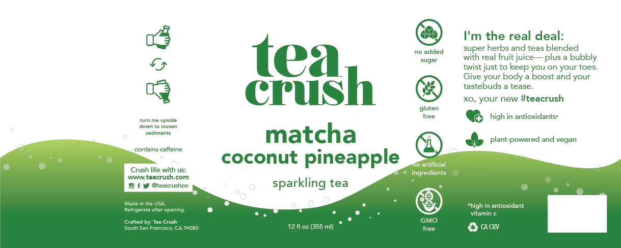
Image Description: a photo of Maya’s hand holding a 12 oz. bottle of Tea Crush (matcha coconut pineapple flavor).
This was my first time designing a label for a food product (and on a cylindrical surface)! the initial design incorporated a transparent label, with a black gradient wave design in the background and white text. it was a simple design that highlighted the glass bottle’s shape and allowed customers to see the bottle’s contents clearly. Overall, the minimal color palette and relatively reserved design acted as a counter to the large, bold logo with playful bubbles.
one issue that I had not foreseen (as at this point I was a novice at designing food labels) was that ultimately, unlike a book, flyer, poster or other print design product, a food product ultimately gets displayed alongside other food products, and in many variable lighting situations. ideally, a food product would stand out in comparison to the other competing products around it and would be easy to spot on a shelf. the black and transparent design did not particularly “pop” on the shelf.
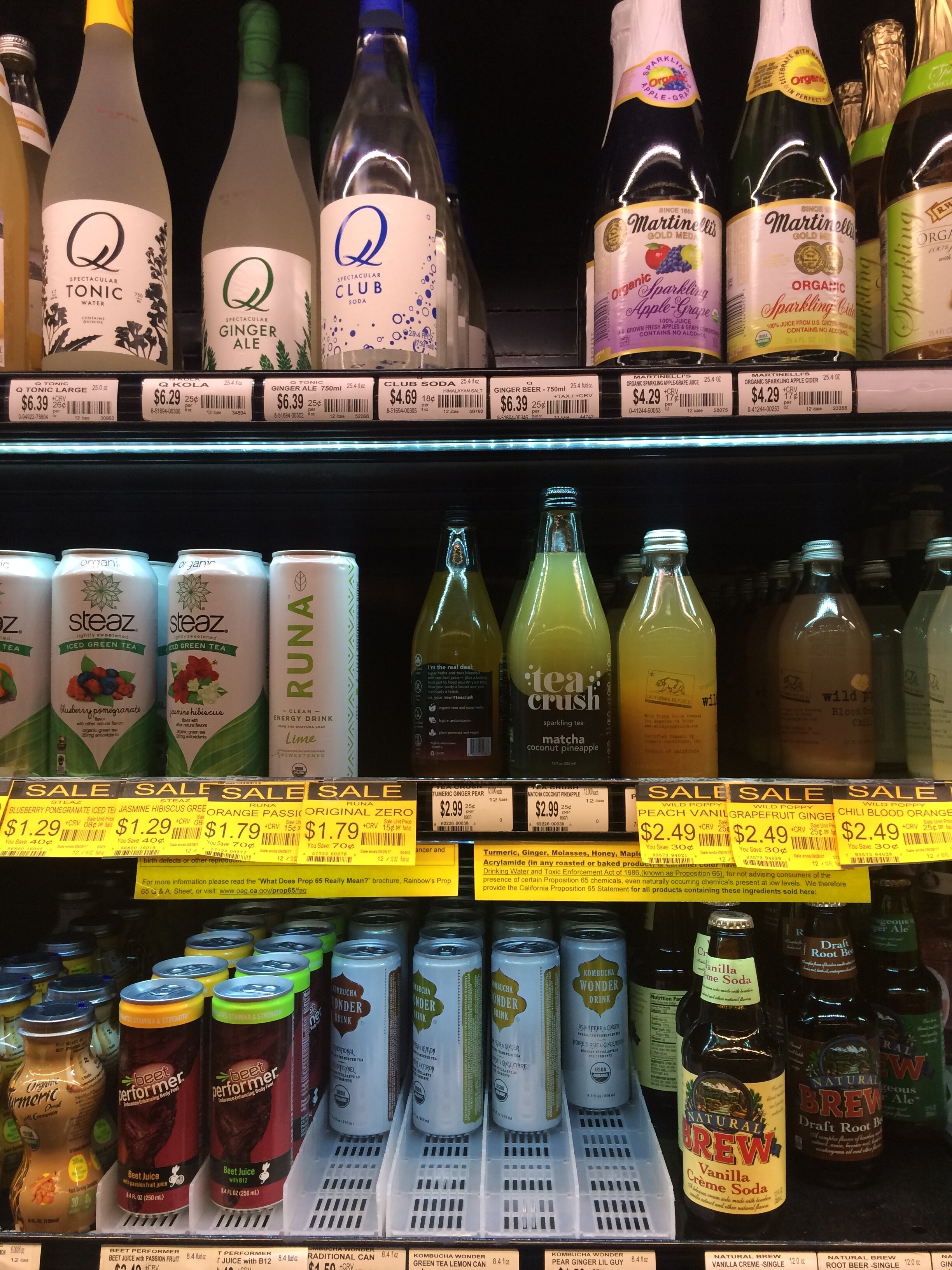
Image Description: a photo of the two flavors of Tea Crush (in the initial black design) in a grocery store’s refrigerated shelf. how easy is it for you to find Tea Crush on the shelf?
this called for a redesign of the labels for the next production run. another consideration to the label design was the different flavors of the product. at this point, there were only 2 flavors of Tea Crush (Turmeric Ginger Pear and Matcha Coconut Pineapple) but another flavor was in the works. should each flavor have a large swath of a different color, or should the different flavors have relatively similar labels? typically, a store would place different flavors of the same product right next to each other. having each label be relatively similar (in design and color) would help create a large “block” on the shelf for the brand.
with this instruction in mind, I designed the label with a white, opaque background, and the wave design in a subtle color gradient for each flavor.
ultimately, though there ended up being many versions of this design with subtle changes, this was the final look and feel of Tea Crush for two and a half years. (Nutrition panel and barcode have been omitted from view).
by the end of 2019, Tea Crush was available in many Bay Area natural foods stores (such as Bi-rite, Berkeley Bowl and Lunardi's), was served in hundreds of corporate offices (including the offices of Google, Facebook, and Tesla) and had just under 15,000 Instagram followers.
the future of tea crush
by the end of 2019, Tea Crush was looking to expand and potentially drastically change their branding. i designed some new branding concepts to explore a possible design overhaul to accommodate such a change.


ultimately, Tea Crush decided to do a total rebrand so they could increase their offerings beyond tea. in February 2020, Tea Crush became Wildwonder!
designing for Tea Crush was definitely an amazing experience for me, especially to have experienced it so early in my design career. I’ll never forget the thrill of seeing my own design in a grocery store!