designing one’s own wedding stationary
generally speaking, I found planning and preparing for my wedding to be a difficult task. I never was big on event planning and did not have any specific childhood vision of what my wedding day would look like. the one thing I did know pretty early on in the wedding planning process was that I definitely wanted to design my own wedding stationary.
it was important to me to honor my own culture as well as my husband’s in the invitations itself. I have Japanese and Indian heritage, and he has Taiwanese and Chinese heritage; both of us were born and raised in the United States.
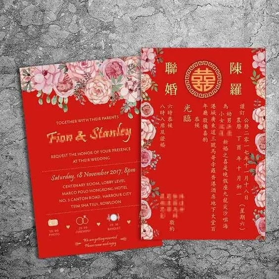
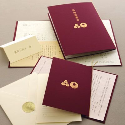
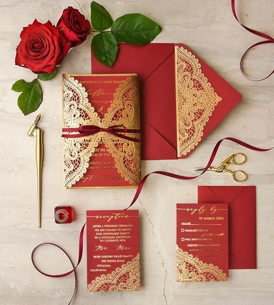
this posed a challenge as I felt that each culture has a pretty distinct aesthetic when it comes to weddings. Chinese culture and Indian culture tended to be bold and colorful (in comparison to Japanese) but the motifs used didn’t have much overlap. Japanese invitations tended to be extremely minimal. (Below, an example from the web of a red Chinese, Japanese and Indian invitation).
Requirements
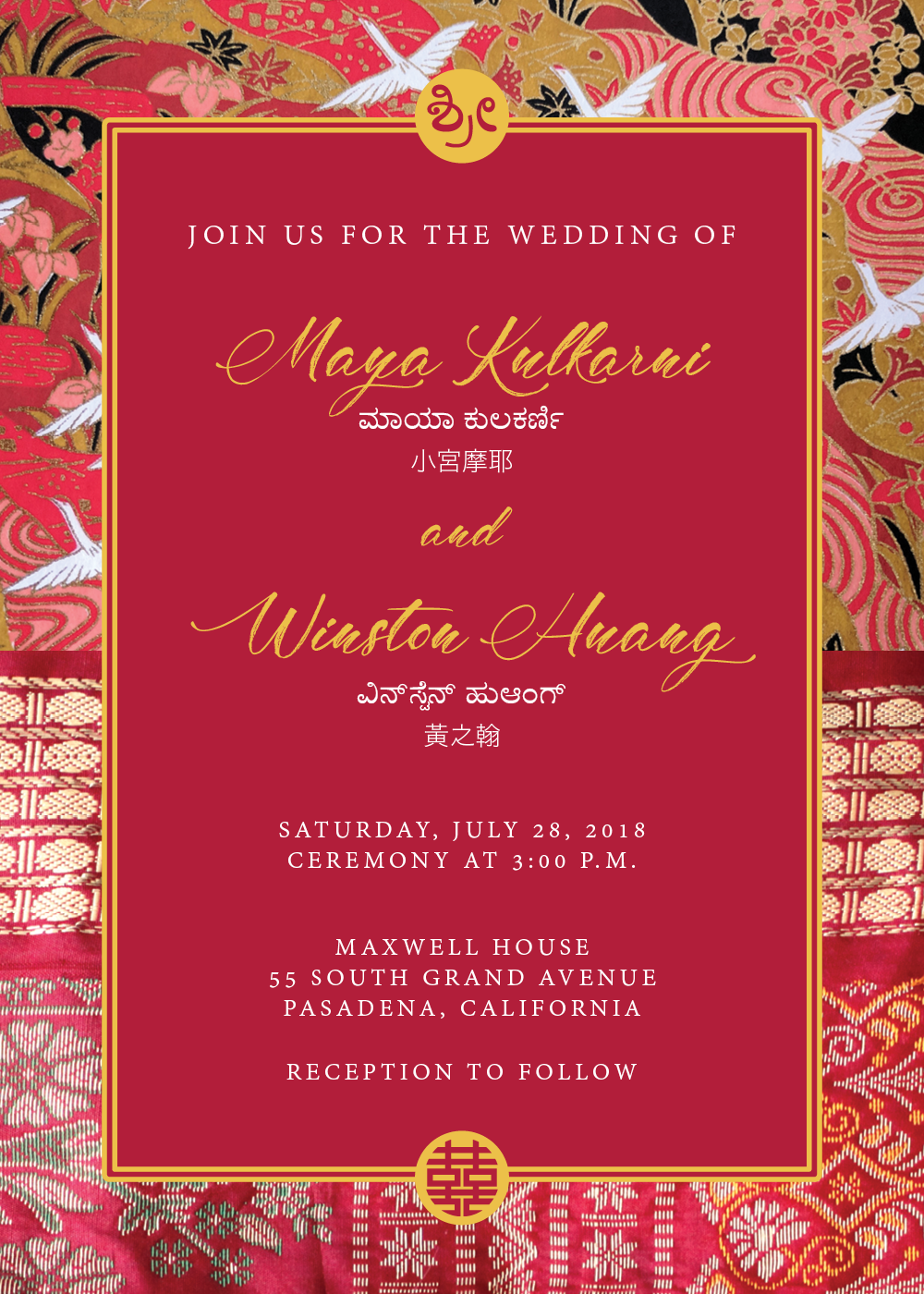
have our names written in English, Kannada (the language of the Indian state my family comes from), and in Chinese characters (Japanese and Chinese share a written script with a lot of overlap)
include auspicious symbols, including the Chinese “double happiness” symbol and the “Shri” symbol (customary to write at the top of an invitation in Indian culture). Use my Japanese family’s crest in some way.
somehow show a connection to Japanese, Indian and Chinese culture.
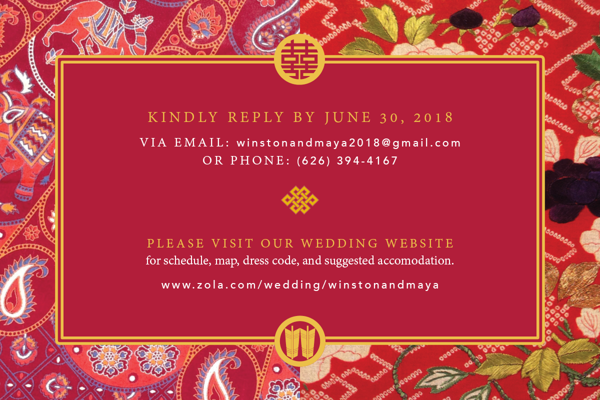
be cost effective. reduce number of pieces in wedding stationary and keep extra printing elements, such as gold foil to a minimum.


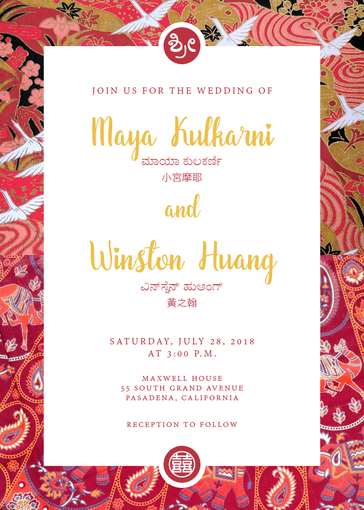
white background
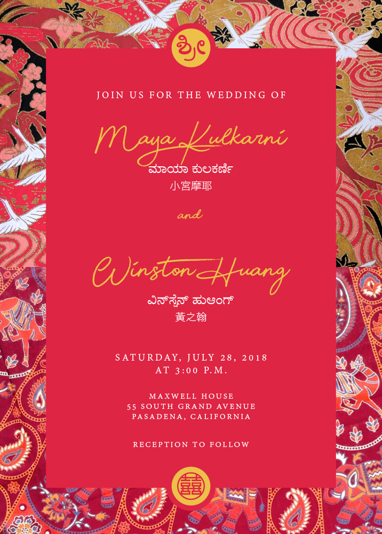
red background
process
the design process for making the wedding stationary was similar to my normal work flow of designing, seeking feedback, and iterating. what made it challenging was that I was my own client; my husband provided feedback but ultimately did not have strong feelings when it came to the wedding stationary. I was hesitant to open up the floor for feedback to our families as I was afraid of getting too much feedback from them. so ultimately it came down to my own sense of feeling “done”.
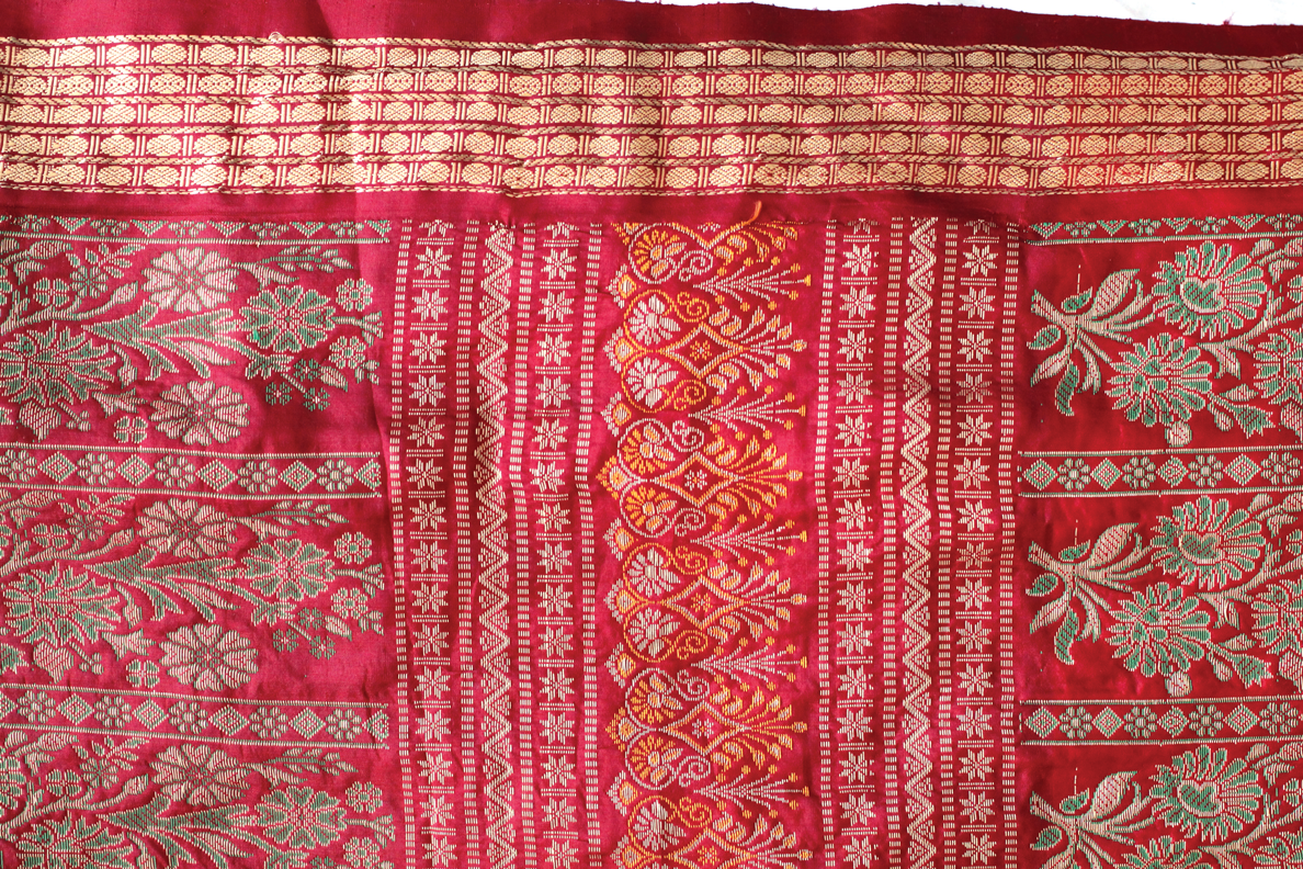
image description: a photo I took of a red sari I owned. I later used this photo in the background of the invitation.
though much of my own design work tends to be on the more minimal side and rarely uses patterns, I felt that for a festive occasion as a wedding the use of patterns could give a wonderful celebratory feel and clearly nod to our cultures. I decided pretty early on that I wanted the top portion of the invitation to make use of a traditional Japanese chiyogami paper design and the bottom portion to use a patterned piece of Indian fabric.
the white background version above was quickly nixed due to me finding out that it is considered extremely inauspicious in Chinese culture to write a name in red ink. I also personally did not feel that the white background version of the invitation alluded to Chinese culture enough; the prints in the background of the image were Japanese (top portion) and Indian (bottom portion) respectively but aside from the single “double happiness” symbol at the bottom I felt that the Chinese representation was minimal.
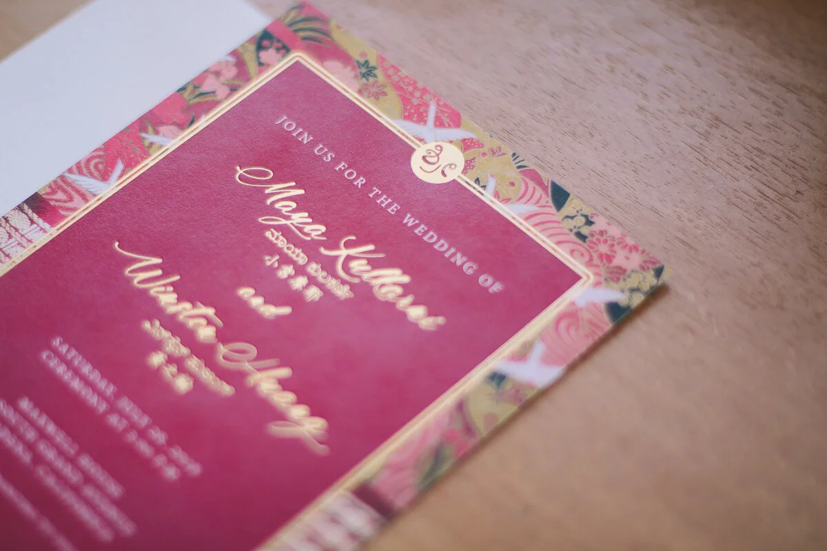
ultimately, since no Chinese patterns were being used, I decided for the overall format and color scheme of the invitation should allude to Chinese culture. through online research, I found that many Chinese wedding invitations made heavy use of the color red. Since writing names in red is inauspicious, I noticed many invitations featured red backgrounds with white or gold text. our names in all languages were written in gold foil (gold foil was used on the border of the card as well).
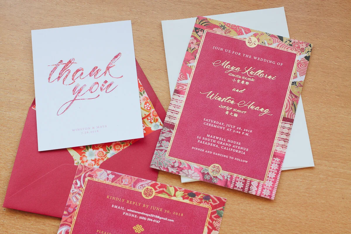
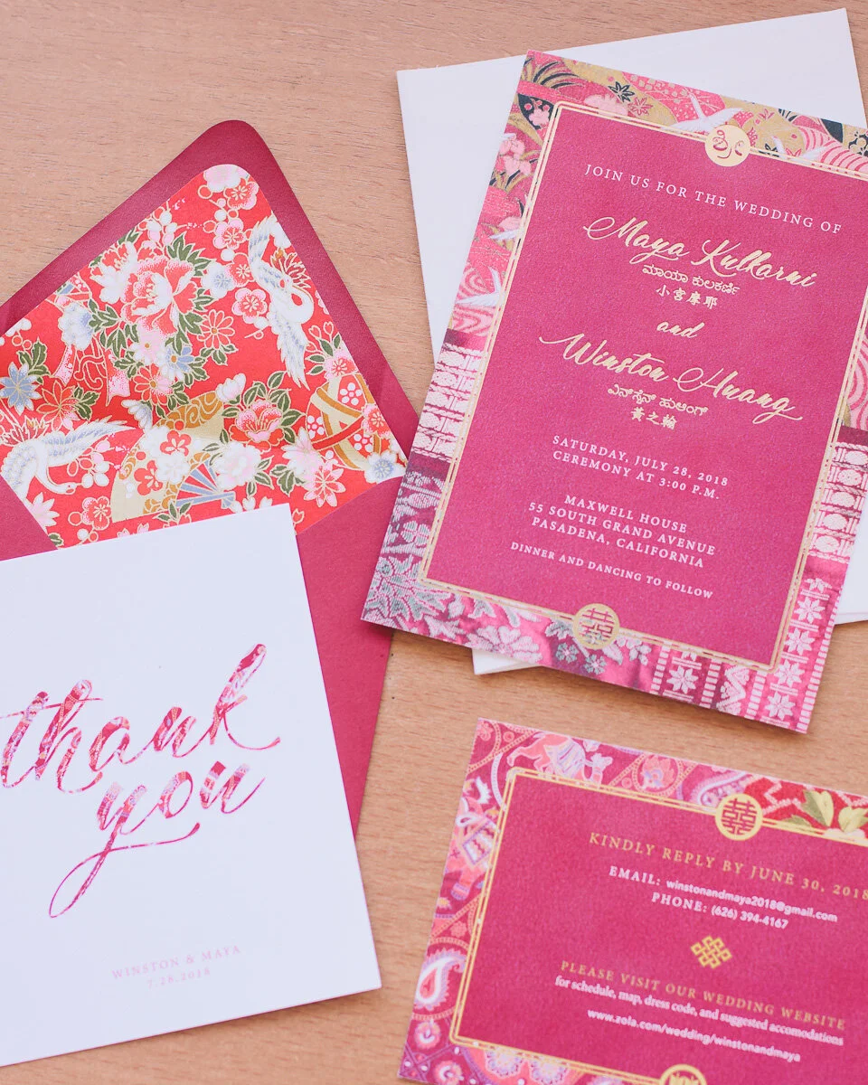
image description: flat lay of Maya’s wedding stationary (that she designed). includes an invitation, RSVP card, thank you card and envelope.
fonts used: Adobe Gurmukhi, for main body text. Madame Cosmetics for our names in English. Kannada MN for our names in Kannada. Weibei TC for our names in Chinese/Japanese. speaking of font… this design also revealed to me challenges that designers face when designing in non-Roman-alphabet languages. while there was a pretty large selection of Chinese fonts, it was very difficult for me to find fonts for Kannada (the Indian script used on the invitation). since Kannada is a lesser known language in comparison to Hindu or Urdu, the font resources for it was very limited as well. to date, I only have access to 4 different Kannada fonts.